


, and a large 4th burner on the right. 4 control knobs in silver")


, and low profile induction zone on the right")


 sat in the bottom left, looking towards his friend Woodstock (a yellow bird) flying in a red hot air balloon")


, with a lever for hot & cold water and a level for filtered tap water")


 kitchen sink in brushed black, Resembles a dark brushed metallic finish")


 green head unit, and brushed (matt) silver base and silver (gloss) food bowl with a handle")
 food bowl with a handle")


 flying away in a red hot hair balloon.")

 is in Coca Cola brand red, and the top 40% of the door is in white, and features the iconic Coca Cola brand logo")


 green")
, with a slightly bevelled as opposed to flat front door and control panel design than")
 is more classical, featuring minimalistic features, stainless steel surround, and large black glass visibility panel in the door.")
 featuring a monochromatic look with black glass and copper trim")
 featuring a minimalistic look in Neptune Grey, with a digital touch control panel")
 in stainless steel, with chrome handle and control dials, black glass, and a centralised control panel.")


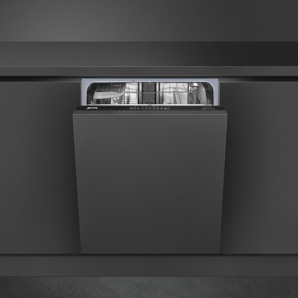
 in Neptune Grey, and a Neptune Grey extractor hood")


Read the interview with Michelle Ogundehin, internationally renowned as a thought leader on interiors, trends and style, to get inspiration to create a successful interior in your home.
Search
Enter at least 3 characters
Read the interview with Michelle Ogundehin, internationally renowned as a thought leader on interiors, trends and style, to get inspiration to create a successful interior in your home.


Rarely bland, never dull, always surprising: grey is a thoroughly contemporary neutral. True, it's had a bad rap in the past, but it's coming in from the cold, again!
You see grey first came to the forefront for sophistication in the home around 2005 with the launch of Farrow & Ball’s Elephants Breath. Here was a colour which instantly captured the popular imagination. It was a game-changing trophy paint that seemed to confer instant luxe. Even the Sunday Times called it “code for classy interiors”.
Why? Because think neutral, and you generally imagine tones of beige or taupe. And not so terribly long ago, neutral also connoted those awful “white-with-a-hint-of-bleurgh” shades too. Neutral was seen as a halfway house to a home with character for those who knew they wanted more than white but lacked the confidence to graduate to full colour. But this kind of neutral was rarely cool. Then along came a cool grey. By which I actually mean a grey that’s been tickled with the merest hint of blue, like Neptune Grey, the new smart finish from SMEG for its built-in kitchen appliances (ovens to coffee machines and more).

In the world of kitchen design, not everything has to be grey. I love the combination of warm grey with raw, rugged wood textures; they complement each other beautifully. Gray works best when it contrasts with other elements in the space.
Grey pairs wonderfully with a wide range of colours, especially soft tones like powder pinks, lavenders, and biscuity beiges, as well as bolder shades like mustard. It's making a comeback as the colour of choice in 2023, offering a contemporary edge and a sense of calm.
Grey represents a subtle revolution, a departure from the brighter fashion trends of the past. It allows us to embrace change without going overboard.
© 2024 SMEG UK LTD
SMEG UK Ltd The Magna Building, Wyndyke Furlong, Abingdon, Oxfordshire, OX14 1DZ
